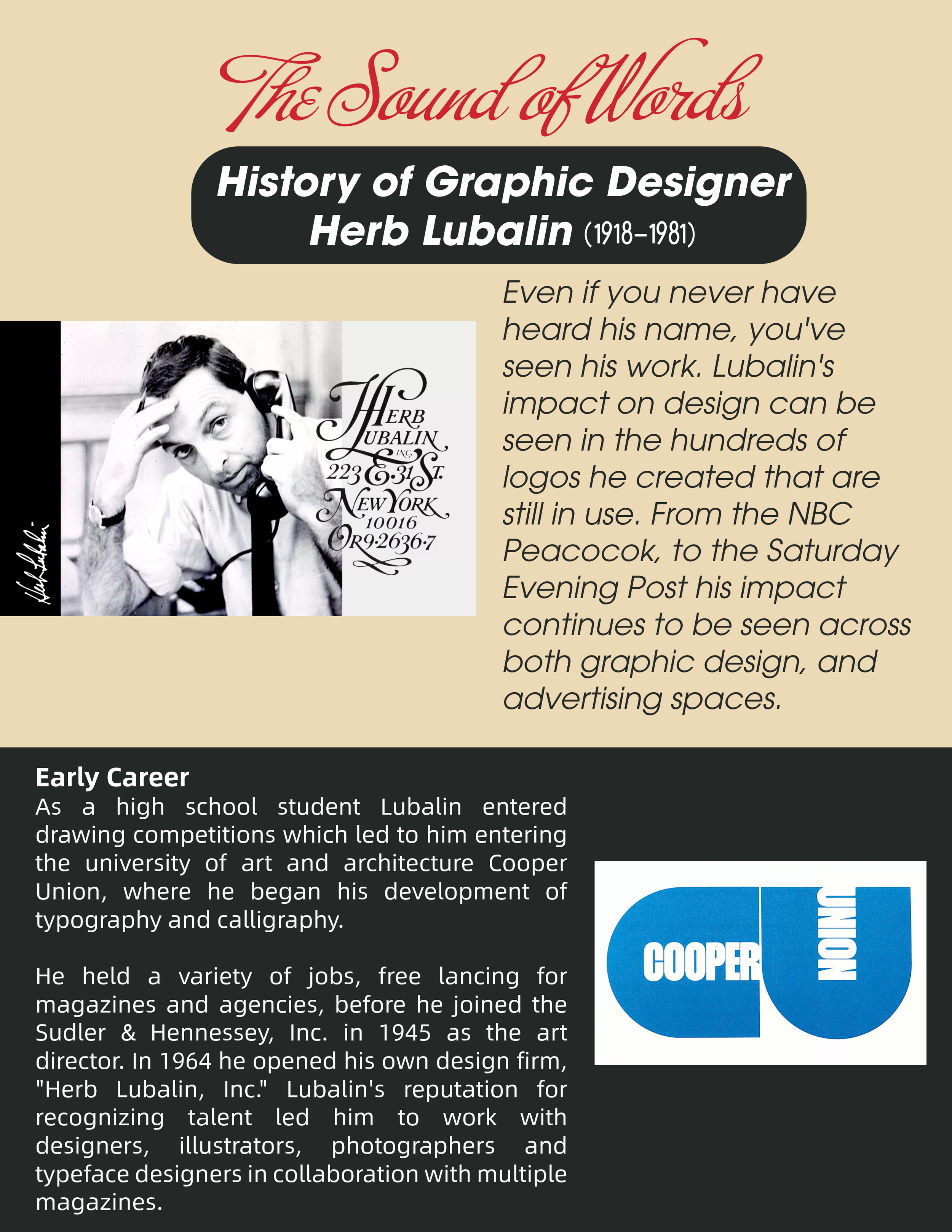
Herb Lubalin, the sound of words
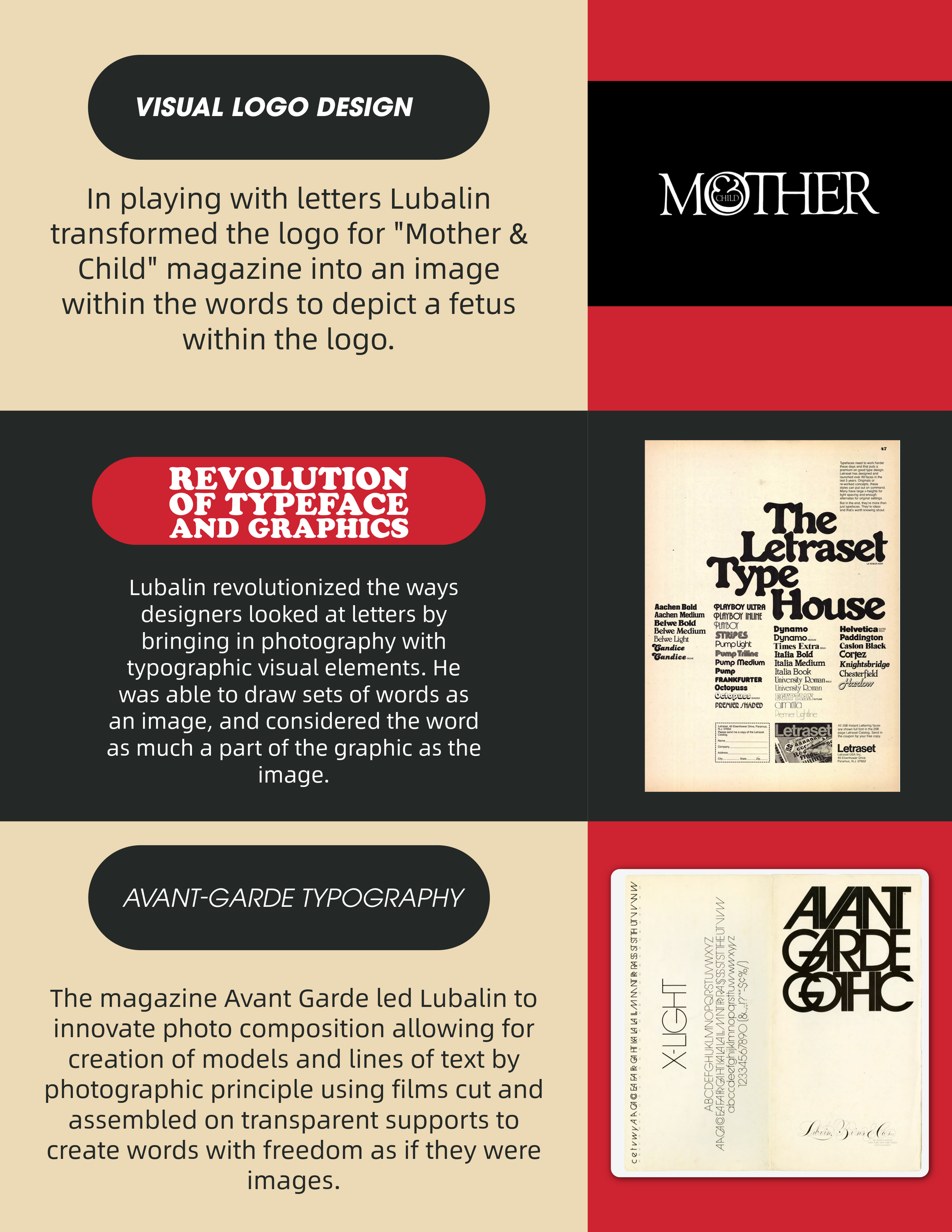
In my design, I chose to keep the colors simple, using only minimal colors of black, white, red, and tan to emphasize the font and words, rather than color emphasis. Looking back at the evolution of typography and design, Herb Lubalin was one of the innovators who used not just words but fonts to support the message of the words. Herb Lubalin was colorblind, and many of his designs focused on typefaces' shapes, relying on simple black, white, and red. My design would not be as effective if I hadn’t kept the color combinations simple and in line with the images I chose from Herb Lubalin’s career. For example, if I had chosen bright neon colors, it would not reflect the message and image selection I chose for this project. My project explored creating a short, 2-page layout showcasing the life and career of Herb Lubalin.
The font choice I used in my design emphasizes the Avant Garde style he pioneered for the text paragraphs. Using a more flourishing font, Buffet Script, for the title showcases words that imitate musical notes. Lubalin first showcased musical notation with text styles in the Sound of Music movie promotion. A key finding is that simplicity is mixed with understanding the goal of the words. I believe my spread design successfully touches on the impact and career of Herb Lubalin while also reflecting the different design styles and principles he pioneered.